New website, better experience
In this news article
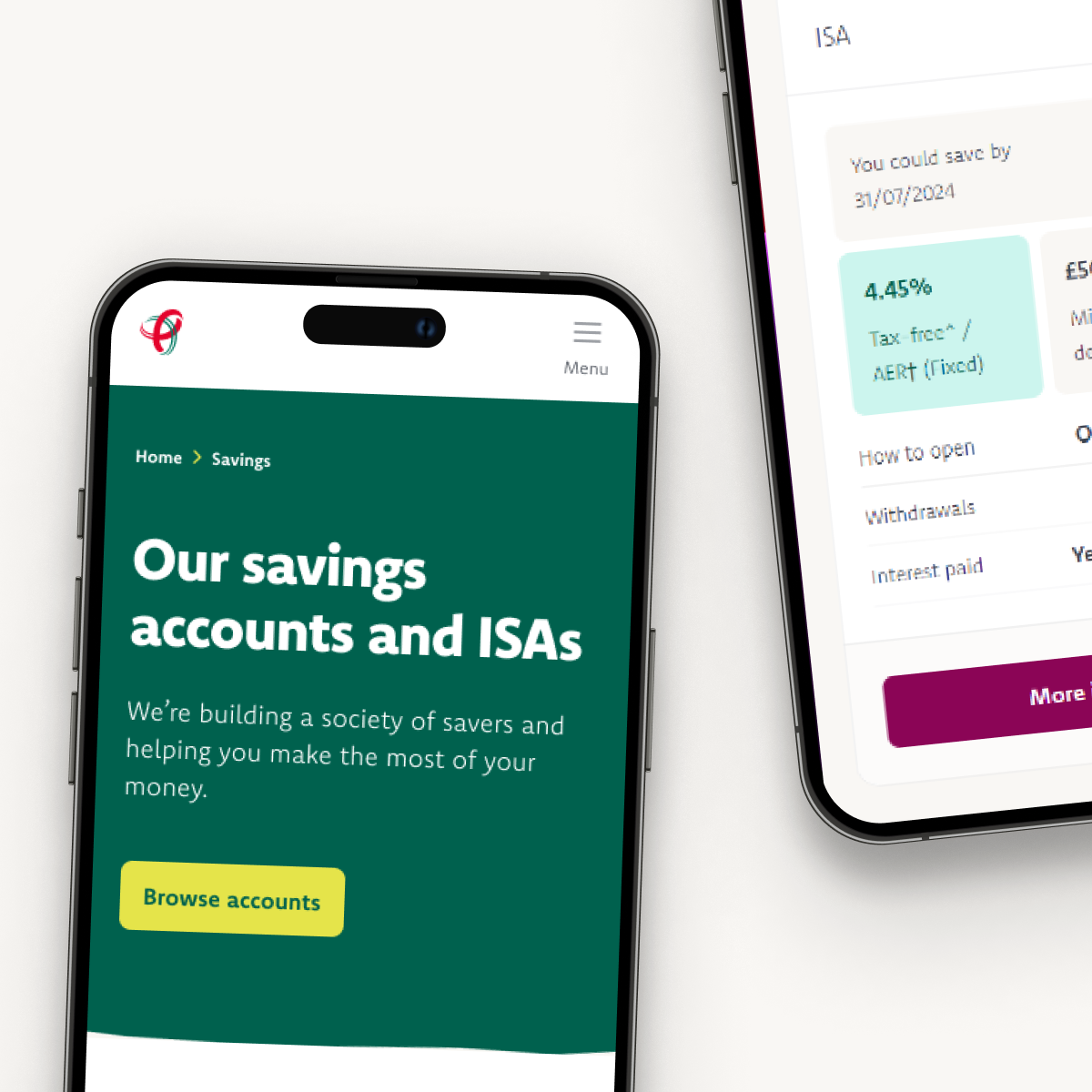
Making things simpler for you
We’ve been listening! You told us:
1. Our website felt cluttered and confusing.
2. It wasn’t easy to find what you needed...
3. ...especially on your mobile.
By understanding what you need we’ve redesigned our website, so you can get around and find what you need more easily.
What's changed?
|
What's in? |
What's out? |
|---|---|
|
Simpler and smoother access to savings accounts and mortgage products. Including better filters to help you narrow down what you’re looking for. And product cards, so you can compare products at a glance. |
Lots of different, confusing product lists that make it hard to find what you need. You told us it was difficult to search for savings accounts and mortgages. And it was tricky to compare the ones you were interested in. |
|
A new support centre with answers to your questions. Think of it as a handy FAQ with answers to your questions. Plus, over 50 quick-read guides to help with your savings, mortgage, insurance, and first home decisions. |
Information spread out over a thousand pages. |
|
We’ve reorganised our menu into subcategories to make it easier for you to find what you need. We’ve aimed for clearly labelled shelves in a newly organized space. |
A cluttered and confusing navigation bar. |
|
We've enhanced the use of accessible colours to improve contrast and readability for screen readers. |
We love our 'dragon red’, but online it makes things difficult to read and wasn’t great for accessibility. You’ll still see it peppered around; but less of it. |
|
Simple language combined with new icons and illustrations to simplify complex financial information. |
Confusing financial jargon on plain, uninteresting pages. |

Why we’ve changed things
We’ve worked hard to make things simpler and easier for you. And we’ve injected some new things into our brand identity but haven’t moved too far away from the look and feel you expect from us at Principality. We’ve listened to input from our Members at every step and we hope these improvements help you find your way around.
We’re going to keep improving things as we go. We’ll be busy understanding what works, tweaking and updating things, and adding new tools and functionality to help you make decisions about your savings and mortgages.
- Newyddion y gymdeithas