New website, better experience
In this article
Why we’ve changed things
We’ve worked hard to make things simpler and easier for you. And we’ve injected some new things into our brand identity but haven’t moved too far away from the look and feel you expect from us at Principality. We hope these improvements help you find your way around.
We’re going to keep improving things as we go. We’ll be busy understanding what works, tweaking and updating things, and adding new tools and functionality to help you help your clients.
What’s changed?
|
What's in |
What's out |
|
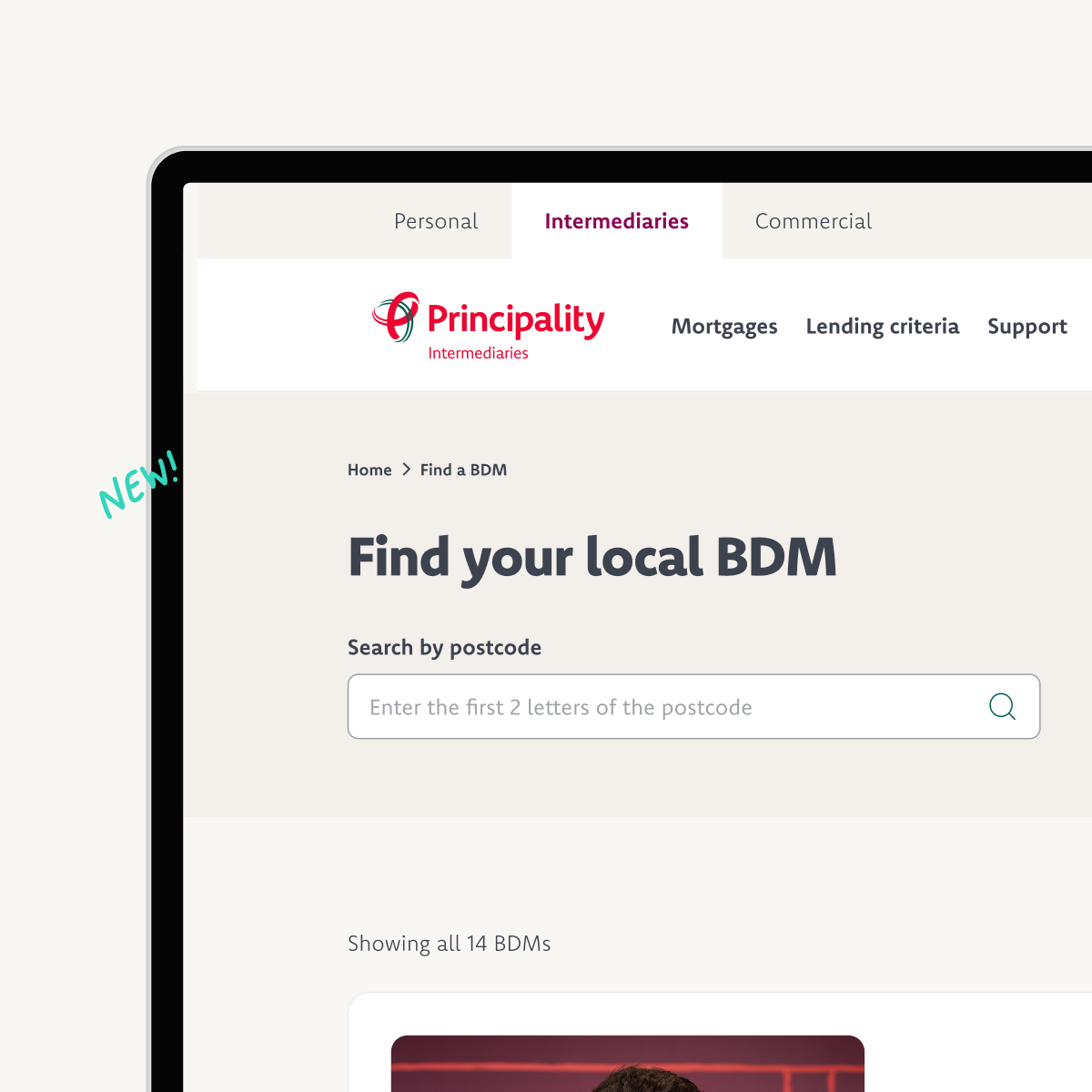
An updated lending criteria tool with an improved search bar and filter, allowing you to find what you need more quickly. Plus a refreshed BDM finder with more information about your local Business Development Manager. |
Information spread across lots of downloadable documents and pages. |
|
We’ve reorganised our menu into subcategories to make it easier for you to find what you need. We’ve aimed for clearly labelled shelves in a newly organised space. |
An unhelpful navigation bar which didn't point you in the right direction. |
|
We’ve made more use of colours that are accessible for people with colour blindness and improve contrast for screen readers. |
Too much red and white on the page. |
|
Simple language combined with new icons and illustrations to simplify complex financial information. |
Confusing financial jargon on plain, uninteresting pages. |
As National Corporate Relationship Manager, Helen leads the Intermediaries team, bringing a wealth of experience from her previous roles across Principality.
Helen and her team work closely with brokers, their networks, and clubs to make more possible for brokers and their clients.
- Broker news